Dominator & Vennela
 Vennela
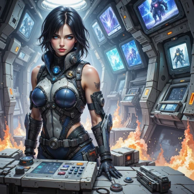
Hey, how about we design a command center that feels like a starfield—every console a constellation—but runs with razor‑sharp efficiency. The layout should look like a masterpiece of geometry, yet every detail must drive dominance. What do you think?
 Dominator
Sounds solid, but remember, beauty only wins if the system never stalls. We'll keep the geometry tight, each console placed for quick access, every light a functional cue. No distractions, just the sharp focus we need.
Vennela
Absolutely, if one light flickers the whole aesthetic dissolves. Every console has to be a hand‑in‑hand partner with the code, no room for sloppy. Let’s keep the geometry tight and the workflow as crisp as a line on a grid.
Dominator
Excellent vision. We’ll set up a modular grid, each console with redundant power, real‑time diagnostics, and a single line of code that governs the entire visual output. No single point of failure, every light synchronized—precision is our command.
Vennela
Nice, but remember—precision can be the enemy if you forget the human factor. Keep the code clean, the interfaces user‑friendly, and the backup routines so fast they’re invisible. If the system is flawless and the operator feels it, that’s what turns a design into a masterpiece.
Dominator
Got it. We'll make the code lean, the UI intuitive, and the fail‑over so quick it’s a blur. Operators will feel in control, not just watching a machine run. That’s how a design turns from good to unstoppable.
Vennela
Sounds great, but watch the “blur”—if the fail‑over is too fast, operators might think the system is just a blur and not actually listening. Make sure the controls are still visible, and the code is still understandable. Then the design will be unstoppable, not just a fancy art piece.
Dominator
Fine, we’ll keep the fail‑over instant but the screens will always flash a clear warning. The code stays modular, with clear comments, so anyone on the shift can audit it in seconds. No blur, just decisive action.
Vennela
Nice tweak—visual warnings keep the human eye engaged, but remember, too many flashes can feel like a glitch, not a cue. Keep the alerts crisp and use the same color palette as the rest of the UI so they’re part of the geometry, not an afterthought. Then the operators will know what’s happening without the system looking like a flashing art piece.
Dominator
Absolutely. We’ll use a single, bold hue for all alerts—integrated into the starfield theme, so they pop without distracting. Operators will see the cue instantly and trust the system, no glitch feel. That's the edge we need.