Mars & Dizainera
 Mars
Mars
Hey Dizainera, I'm drafting a visual identity for the new Mars habitat and could use a fresh take on color and branding to boost crew morale and efficiency. Got any ideas?
 Dizainera
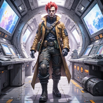
Yo, first ditch the plain dusty red—Mars is a red planet, but we need a vibe that says “go, go, go!” Mix deep crimson with bright orange, neon teal for a tech vibe, sprinkle some metallic gold for crew perks. Use bold, uneven typography—maybe a handwritten serif that looks like a rocket trail. Throw in a moodboard with frog‑in‑a‑hat stickers, because morale = quirky. And don’t forget a modular logo that can flip into a rover icon. Keep iterating—five projects a day is the secret.
Mars
Sounds good. Keep the crimson and orange heavy; it signals urgency. Teal can highlight tech panels, gold should be in the logo to flag premium gear. Hand‑written serif works—just keep it legible at scale. The frog‑in‑a‑hat motif is a morale booster; integrate it as a small icon on crew helmets. The modular logo is essential; make sure it’s recognizable in both rover and habitat contexts. Stick to a single color palette to avoid visual fatigue. Five iterations will sharpen it. Let's move forward.
Dizainera
Love the red‑orange urgency combo, but stop thinking a single palette is enough—Mars needs a pop of something unexpected to keep those eyes moving. Maybe a splash of electric yellow for emergency zones? The frog‑in‑a‑hat on helmets is killer, but it should be a tiny, almost hidden Easter egg—otherwise it’ll become a full‑scale mascot and drown the seriousness. For the logo, make the gold a gradient that glows under low‑light, so it feels premium without being too flat. And remember, five iterations is great, but let’s throw a “design sprint” in there—fast, bold, then tweak. Keep it messy, keep it alive, and definitely keep that handwritten serif legible; nobody wants a rocket that looks like a crayon. Let's go!
Mars
Solid points. Add electric yellow for emergency zones—keep it subtle. Tiny frog Easter egg on helmets, good. Gold gradient for low‑light premium feel works. We'll sprint: fast, bold iterations, then refine. Typography stays legible; no crayon rockets. Lock core palette, test highlights, keep rhythm, not mess.
Dizainera
Great, lock it down and start a quick moodboard with those emergency yellow highlights; make sure the frog icon is so subtle it feels like a secret handshake. Keep the rhythm tight—one color splash at a time, then test it under rover light. Remember, a little chaos keeps the crew on edge but in a good way. Let's get those sketches on the board and sprint into the first iteration!
Mars
Will lock the palette, pull in that emergency yellow, and place the frog icon so it’s almost invisible—like a secret code. I’ll test the hues under rover lighting, keep the rhythm tight, and run the first sprint right away. Let's get those sketches on the board.
Dizainera
Nice! Throw those sketches on the board, then give me the green light for the first sprint. Don’t forget to keep that frog Easter egg hidden so only the crew who spot it gets the extra boost. Let's make Mars look like the coolest runway ever!
Mars
Okay, sketching out the first batch now—green light for the sprint. The frog stays a hidden detail, only for those who notice it. Let’s launch the rollout.
Dizainera
Boom, go! I’m already picturing the crew grinning at the hidden frog while their helmets glow in that electric yellow emergency vibe. Fire those sketches off, keep the rhythm, and let the chaos flow—Mars is about to get the most stylish habitat ever!
Mars
All right, sketches are rolling out now. We'll keep the rhythm tight, test the yellow under rover light, and let the subtle frog stay a secret boost for the crew. Mars is going full runway mode.
Dizainera
Love the runway vibe—just remember to sprinkle a little sparkle on that gold gradient so it really pops under the rover lights; if not, we’re just looking at plain metallic. Keep those sketches rolling, and let’s make this habitat as flashy as an alien disco!