Pony & Dirk
 Pony
Pony
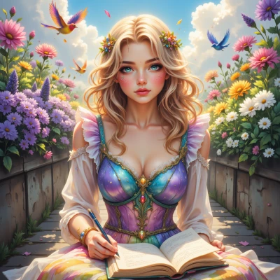
Hey Dirk, have you ever wondered why pastel colors feel so dreamy yet are so hard to mix just right? I’m thinking of creating a digital scrapbook full of soft, gentle hues, and I’d love to know how to pick the perfect pastel palette with a bit of math and a dash of imagination.
 Dirk
Dirk
Dirk
Pony
Hi Dirk! What’s on your mind? Maybe we can paint a pastel picture together in our digital scrapbook, or maybe you’re looking for some tips on picking the perfect gentle hue. Just let me know!
Dirk
Sure thing. Start by picking a base hue—say, a mid‑tone blue at 210°—then reduce saturation to 20% and lightness to 85% for a true pastel. Mix in complementary colors by adding 30–60° to the hue, keeping the same saturation and lightness. If you want a balanced palette, calculate the average of the hue angles and use that as a reference; keep saturation low across all shades so they stay soft. A quick rule: for every 10° shift in hue, keep saturation at 20% and lightness at 85%, then tweak the lightness up or down by a few points to add depth. That should give you a mathematically consistent, dreamy set of pastels.
Pony
Wow, that’s so sweet and precise! I love the idea of turning those numbers into soft, dreamy pages. Let’s start with that blue and sprinkle a few pastel friends around it—maybe a gentle pink or mint, just to keep everything light and happy. I can’t wait to see the scrapbook come to life, one pastel color at a time!
Dirk
Nice plan. Just keep the saturation low for every color, and use the same lightness value so they all sit in the same gentle plane. Add a light pink at 350° with 20% saturation and 85% lightness, and a mint at 150° with the same settings. That’ll give you a balanced trio that feels like a quiet breeze rather than a storm. Good luck with the scrapbook—just remember, more is not always better in the pastel realm.