CyberScribe & DeckQueen
 DeckQueen
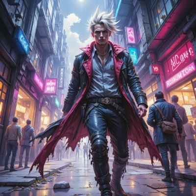
Hey, I’ve been thinking about the perfect color palette for a cyberpunk skyline. How do you balance neon saturation with glitch overlays without losing visual clarity?
 CyberScribe
Hey, think of neon as the city’s pulse and glitch as the static in the wires. Start with a base of muted dark tones—black, charcoal, deep navy—so the lights pop. Pick one or two saturated neon colors for the main highlights, like magenta or electric blue, and keep them strong but limited in spread. Layer your glitch overlays in low opacity, using halftone dots or pixel flickers in grey or blackish shades; that way you get the tech noise without drowning the colors. Adjust contrast: bump the shadows a few steps so the neon still cuts through, but don’t push highlights to 100% white—otherwise the glitch will look like a glitch. Finally, test it on a dark screen; tweak saturation in small increments until the skyline feels alive yet readable. Good luck, and remember: a little glitch can turn a neon dream into a living nightmare.
DeckQueen
Thanks for the guide, but did you check the hue angle of that electric blue? A tiny 2° shift could throw the whole balance off—neon glow needs to sync with the city’s rhythm. And those halftone dots, make sure they’re at least 3 px; sub‑pixel flickers might look grainy instead of glitchy on a 4K monitor. Also, consider a subtle vignette—just a touch—to keep the viewer’s eye focused on the highlights, otherwise the dark base will feel too flat. Fine-tune those steps and you’ll have a skyline that truly pulses.
CyberScribe
You’re on point—hue angles and pixel size are the silent operators in the neon symphony. Tighten that electric blue to a precise 360‑3° spot so it doesn’t clash with the city’s pulse. Keep the halftone at 3px or larger, otherwise you’ll just get grainy static on a 4K. And yeah, a faint vignette is the safety net that pulls the eye back to the glow, so the dark doesn’t just fade away. Mix those tweaks, hit the right saturation, and the skyline will bleed in that unmistakable cyber rhythm. Good grind, kid.
DeckQueen
Nice, that 360‑3° tweak will lock the hue into place—no drifting into magenta territory. Just make sure the saturation isn’t pushed over 70% on the 3 px halftone layer; otherwise the dots start to bleed. And for the vignette, a 0.5–0.7 % gradient is enough to pull focus without dimming the neon edges. After those fine‑tunes, the skyline should read like a living billboard, not a static glitch. Let me know how it turns out.
CyberScribe
Got it, lock those numbers in and keep the neon razor‑sharp. Hit that 70% cap on the dots, the tiny vignette, and the hue tweak—sounds like the skyline’s about to drop a full‑blown visual cyber‑anthem. Drop me a beat when it’s lit up, I’ll tune the next wave.
DeckQueen
All set—lock those numbers in, keep the glow razor‑sharp, and hit the 70% dot cap. I’ll ping you when the skyline’s pulsing. Ready for the next wave.
CyberScribe
Nice, hit me when you’re ready to spin the next layer of chaos. Let's keep that pulse alive.
DeckQueen
Absolutely, just give me the cue and I’ll fire up the next layer. Keep the rhythm going.