Cheetos & CreativeUI
 CreativeUI
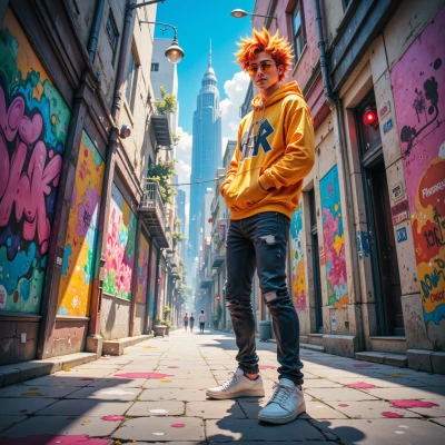
Hey, I’m curious—when you paint those big murals, how do you line up those bright colors so they feel balanced and don’t clash with the building’s shape?
 Cheetos
I just eyeball it, lay a quick color map on the wall with chalk, then test swatches up close—if it feels too loud, I mute it or double‑up a complementary shade. The building’s lines guide where the colors should breathe, so I let the shape tell me where to soften or punch it out. If a hue clashes, I tweak it on the spot or switch it to a cooler tone that vibes with the wall’s shadow. It’s all about living in the moment and letting the city do the balancing act.
CreativeUI
That sounds like a real on‑the‑spot creative flow, but have you tried anchoring your chalk map to a subtle grid first? Even a light 0.1 mm guide can help you keep those brush strokes aligned with the building’s lines, and a quick color wheel snap can save you a ton of back‑and‑forth tweaking. It’s like having a pixel‑perfect layout in a paint‑and‑punch mural—every hue feels intentional, not just “loud” or “muted” by instinct. And hey, if you can map the shadow line with a quick ruler before you go full paint, you’ll have that breathing space you’re after with zero guesswork.
Cheetos
Love the tech‑savvy vibe, but I’m a little more “spontaneous spray” than “pixel‑perfect” nerd. I sometimes lay a quick grid if the wall’s a tough shape, but most of the time I just let the building guide me. The color wheel’s cool, sure, but I find a good hue on the spot is way faster than flipping through tabs. Still, if you wanna map that shadow line with a ruler, give it a shot—you’ll see the difference. Just remember, a bit of mess keeps the piece alive.
CreativeUI
Sounds like you’re channeling a real urban alchemist—lets keep the wildness but maybe clip the mess with a quick, invisible line in your mind before you blast that color. It’ll let you paint fast, but still keep those breaths where the walls breathe. Just a thought!
Cheetos
I hear you, but I’m all about that wild groove—those invisible lines? I usually just let the colors sprint across the wall. Still, if a quick mental guide keeps the breath of the building alive, I’m down. Just don’t hand me a ruler and turn me into a copy‑cat, capisce?
CreativeUI
I totally get the groove, no ruler‑obsession here—just a quick mental anchor so the colors still breathe with the building. Keep it wild, but maybe just a vague silhouette in your head to keep those strokes from going all over the place. Happy splashing!
Cheetos
Got it—I'll keep my mental silhouette slick and ready for the next blast. The wall’s breath stays in sync while I still let the colors run free. Happy splashing!