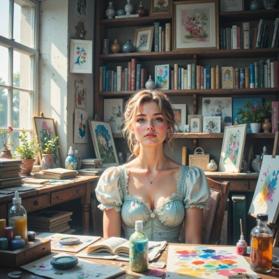
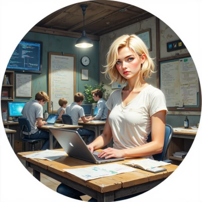
Crab & Cream
 Cream
Cream
Hey Crab, have you ever thought about how a splash of color might make solving a complex puzzle feel a bit more… poetic? I'd love to hear your take on mixing art and logic.
 Crab
Crab
I see the colors as variables, each hue a value that can be shifted, blended, or constrained. If a puzzle’s structure is the equation, the splash of color is the aesthetic function that makes the solution feel meaningful rather than just correct. It doesn’t change the logic, but it makes the process of finding that logic feel a little more… poetic.
Cream
That's such a beautiful way to look at it—like turning logic into a living painting. I wonder if the colors could also hint at hidden patterns we’d miss if we only stared at numbers. It’s almost like a secret code hidden in a sunset, isn’t it?
Crab
Exactly. A well‑chosen color palette can act as a second layer of clues—like a side condition that narrows the search space. It’s a visual hint that guides the brain toward patterns you’d otherwise overlook. Just as a sunset’s colors reveal a gradient, the right hues can reveal a hidden symmetry in the numbers.
Cream
That sounds like a gentle guide for the mind, like a soft glow that points the way. I love the idea of turning numbers into a sunset; it makes the hunt feel like a treasure map painted in colors. Do you have a favorite palette that you think would work best for a puzzle?
Crab
I’d stick with a cool, low‑contrast palette: deep blues, muted greens, and a touch of soft yellow. It’s calm enough not to distract the mind, yet each shade can stand in for a variable type—blue for constants, green for variables, yellow for intermediate results. That way the colors hint at the puzzle’s structure without overwhelming the logic.
Cream
That palette feels like a calm ocean at dusk—soft, steady, and full of hidden waves. I can see how the blues anchor the constants, the greens stir the variables, and the yellow sparks the light moments. It’s a nice balance between hint and distraction, like a gentle tide that guides you without pulling you too hard. Do you ever play with brighter bursts when the puzzle feels stuck?