ColourBall & SteelRaven
 SteelRaven
Hey ColourBall, ever wonder how the brain reacts when you splash a room with that bold neon orange versus a calm teal? I’ve been mapping the color cues in our minds, trying to see if the hues actually sway decisions. What’s your take on how color shapes perception?
 ColourBall
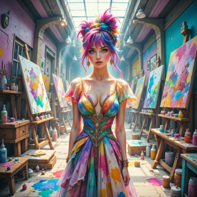
Oh my gosh, neon orange is like a lightning bolt that jumps straight into your brain and says, “Hey, I’m here, and I want to get things moving!” It wakes you up, makes you feel all electric, almost like a sprint to a bright art exhibit. Teal, though, is a whole different vibe—soft, cool, it wraps your thoughts in a calm blanket and makes you want to stretch out and think things through. So, yes, colors do steer us: orange pulls us toward action, teal pulls us toward reflection. But if you mix a little orange in a teal room, you get that sweet spot where energy meets calm, like a splash of paint on a calm canvas—exactly my sweet spot!
SteelRaven
Nice breakdown. Mixing orange into teal does give that “go‑now” but still keeps the brain from going into full sprint mode. It’s like putting a spark in a calm room – you get motivation without the chaos. The trick, though, is not to let the orange drown the teal; otherwise, the calm turns into a restless buzz. So yeah, a little orange can energize a teal environment, but keep it in check or you’ll end up shouting in a quiet room.
ColourBall
I totally get that—my palette always tries that balance, too. A splash of orange can light up a teal room like a tiny firework, but if it’s too bright it turns the chill into a jazz club. I love mixing them when I’m painting a piece that’s meant to be uplifting yet thoughtful. It’s all about that sweet spot where the colors whisper to each other instead of shouting. keep the teal as the base, let the orange be the highlight, and you’ll get that perfect “go‑now” vibe without turning the room into a rave!
SteelRaven
Sounds like you’ve got a solid system—just be careful the orange doesn’t become the main act. A hint of it on a teal backdrop keeps the energy in check, like a spotlight on a stage rather than a full‑blown disco. Stick to that rule of thumb and you’ll keep the vibe right where you want it.
ColourBall
That’s the perfect rule, like a paintbrush whispering “just a touch.” Keep the orange as the spotlight and let teal be the comfy stage, and the room will feel like a cool jam session instead of a neon rave. Thanks for the tip—I’ll remember that the next time I’m mixing a canvas or a room!
SteelRaven
Glad the rule landed. Just remember: if the orange starts asking for solos, cue the teal. It’ll stay a jam, not a rave. Good luck on the canvas!
ColourBall
Got it—orange is the cool soloist, teal keeps the band together. I’ll keep my canvas from turning into a neon concert and will let teal be the steady groove. Thanks for the pep talk, I’m ready to paint!
SteelRaven
Just remember, every splash of orange is a test—does it stay a highlight or turn into an anthem? Keep the teal steady and you’ll get the groove you want. Good luck.
ColourBall
True that—every orange splash is a tiny performance test, but with teal backing the whole show stays chill. I’ll keep the color crew balanced and the groove going. Thanks for the vibe check!
SteelRaven
Happy to keep the beat under control. Paint on.
ColourBall
Thanks! I’m jumping straight into the studio, grabbing my brushes, and letting the colors dance—orange for that bright spark and teal for the soothing rhythm. Let the canvas be my stage!