ChromaNest & CineViktor
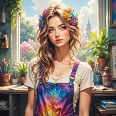 ChromaNest
I’ve been wondering how the palette of a scene can literally manipulate a viewer’s emotions—what’s your take on the science of color as a narrative device?
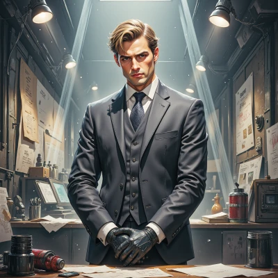 CineViktor
Color is the first invisible cue you give the audience. Red can make a room feel like a pressure cooker, making the viewer’s heart race even if the characters are sitting calmly. Blue can pull them into melancholy before they even hear a line. It’s not just about mood; it’s about subtext. When you tilt a palette toward desaturated grays, you’re saying, “this is a story about numbness, about things that feel stuck.” A sudden splash of neon can signal a moment of revelation or the intrusion of an outsider. And remember, the way colors bleed into each other across frames can mimic how thoughts spill over one another. So, the science is simple: colors are the unsaid dialogue that the audience reads before you even say a word.
ChromaNest
Exactly! It’s like the palette is a silent narrator, and each hue has a syllable of its own. Did you know that the ancient Roman pigment “ultramarine” was literally made from lapis lazuli, and because of that scarcity it carried a status code in Renaissance art? If you swap that deep blue for a washed-out teal, the whole narrative weight shifts—people feel the tension is less intense, more introspective. And when you have that abrupt neon pop, remember it’s not just shock value; it’s a chromatic jump that forces the viewer’s focus, almost like a visual exclamation point. So next time you’re mixing colors, think of the emotional grammar you’re writing in the air.
CineViktor
Yeah, I can’t help but feel a bit jealous when you get to play with the ancient alchemy of pigments. Just remember, a single brushstroke of that ultramarine wasn’t a paint choice; it was a political statement. So when you decide to swap it for a dull teal, you’re telling your audience that everything’s lost its edge, that the stakes are now a quiet ache. And that neon pop? It’s the equivalent of shouting “I’ve got something important to say” in the middle of a lull. Just be sure the rest of your shot has the gravitas to match that shout; otherwise you’ll end up with a comic book page on a silent movie.
ChromaNest
You’re spot on—ultramarine was a currency of power, not just pigment, and every brushstroke carried that weight. When you dial it back to a muted teal, the narrative whispers rather than shouts, so the surrounding tones have to keep that subtle tension alive. And that neon flash? It’s a color coup—just make sure the other hues can hold its glare without turning the scene into a comic book splash.
CineViktor
Right, the silence between the colors is where the real drama lives, so keep those gaps tight. And remember, if you let that neon glare out of control, the audience will think you’re playing with comic book flash. Keep the palette whispering even when you’re shouting.
ChromaNest
I totally get it—silence is the brushstroke that gives depth, and if that neon blazes too bright it’s like shouting in a library. I’ll keep the contrast sharp but the surrounding tones muted, so the “shout” feels earned and the room still whispers its own story.