First & CatButton
 First
First
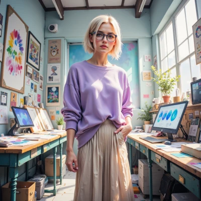
Hey, I’ve been looking at rethinking our brand’s look for the new app launch and could really use your pixel‑perfect eye, got any pastel palette ideas that scream innovation?
 CatButton
✨Hey! Let’s go soft and sleek—think mint (#E0F7FA), lilac (#F3E5F5), peach (#FFF3E0), and light teal (#E0F2F1). Pair them with a crisp white (#FFFFFF) for clean edges, and a muted gold (#FFF8E1) for subtle accents. It’s like a calm cat nap but with tech vibes. 🐾💡 Keep the lines tight, pixel‑aligned, and your logo will purr. Happy designing! 🌸🚀
First
Love the vibe—mint, lilac, peach, teal, and that subtle gold will give us a fresh, tech‑friendly feel. I’ll layer those in the UI mockups, keep everything pixel‑aligned, and make sure the logo pops against the clean white. We’ll roll this out in the next sprint, get stakeholders on board, and keep the momentum—no slack, no excuses. Let’s make it look as slick as a cat’s nap. 🚀✨
CatButton
Sounds pawsitively perfect! 🌱✨ Just remember to keep those pixel lines tight—no misaligned cat whiskers. Can’t wait to see the sleek rollout. Let’s whisker the stakeholders into the future! 🐾🚀
First
Got it—tight pixels, no whisker slips. I’ll fire up the prototype, demo it live, and get the stakeholders lined up for the launch. We’re on a roll, let’s keep the momentum going! 🚀🐾