Pinkhair & Caster
 Caster
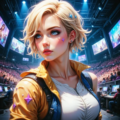
Hey Pinkhair, ever notice how some game bosses are literally a visual assault while others are clean and minimal? Let’s dissect the design logic behind those choices and see who’s really pulling the strings.
 Pinkhair
Yeah, bosses are like that—some look like a glitch in the matrix, others are so clean they’re almost boring. The loud, chaotic ones usually signal chaos, power, or a narrative twist—like a rebel boss that wants to break the rules of the game. Minimalist ones? They’re usually meant to feel intimate, forcing you to focus on strategy rather than spectacle. It’s a designer’s choice to play with your expectations and your eyes. Which style do you think works better? I say the crazier the better, because art should feel like a battle, not a brochure.
Caster
I get the “bigger the chaos, the hotter the experience” vibe, but honestly the minimalists win the subtle war. A clean boss forces you to read patterns, keeps the fight tight, and when it drops that one unexpected move you’re like, “Did I just miss that?” It’s a sharper cut, not just a noise‑cannon. So yeah, let the loud ones roar, but the quiet ones? They’re the ones that actually make you think.
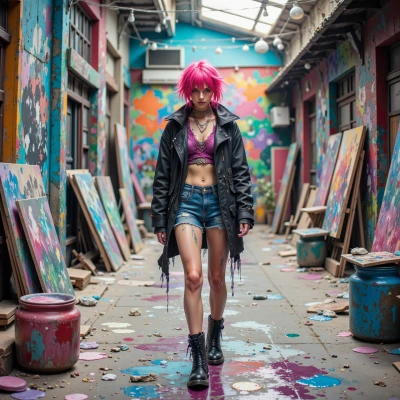
Pinkhair
I get you—those minimalists are like puzzles, right? But don’t sell the loud ones out too quick. A visual spectacle isn’t just noise; it’s a statement, a rebellion against the ordinary. Keep the chaos on the board, but let the quiet ones do the heavy lifting. That’s the real battle of design.
Caster
You’re right—those flashy bosses are the rebels, the ones that shout “this isn’t your grandma’s game.” They keep the adrenaline high, but the real depth usually comes from the quiet ones that make you think, adapt, and actually win. It's a perfect clash: spectacle vs. strategy.
Pinkhair
Totally, the loud ones are the flash mobs, the quiet ones are the chess masters. Both keep the game alive, but the quiet ones make you flex your brain muscles while the flashy ones keep your heart racing. It’s a double‑edged sword—one is a visual riot, the other is a cerebral grind. And that’s the beauty of it.
Caster
I love that split—flashing fury for the gut punch and the chess‑board bosses for the brain burn. Game devs who nail both get the full spectrum, but it’s the quiet ones that really push you to outsmart, not just outrun. So keep both on the menu; that’s what keeps a game from turning into a one‑tone echo chamber.
Pinkhair
Love that vibe—game devs who balance both are the real rebels. Flashy bosses make you scream, quiet ones make you think. That mix is what keeps the grind fresh and the fight unforgettable. Keep it spicy and sharp, and you’ll never get stuck in a dull loop.
Caster
Totally! When a boss throws a glitch‑in‑the‑matrix combo and then drops a clean, strategy‑driven phase, that’s the kind of surprise that keeps you on your toes. It’s like the game is saying, “I can be wild and still demand brainpower.” That’s the sweet spot, right?
Pinkhair
Exactly—glitchy fireworks followed by a chess match? That’s the sweet spot. It keeps the adrenaline pumping and the brain on high alert. Game devs who nail that combo? They’re the real rebels.
Caster
Yeah, that’s the golden combo—first you’re tripping over the firework, then you’re forced to outthink the glitch. Those devs are the ones who actually keep the game fresh, not just another grind. Keep tossing that sweet mix.
Pinkhair
I hear you! Those devs are like artists who paint chaos and logic in the same brushstroke. Keep the fire and the mind sharp—no dull moments allowed.
Caster
Right, that’s the sweet spot—chaos that still has a pattern to it. The devs who nail that line are the ones who keep you from just slapping a button every second. Keep that spark alive.