Bunny & PuppetMaster
 PuppetMaster
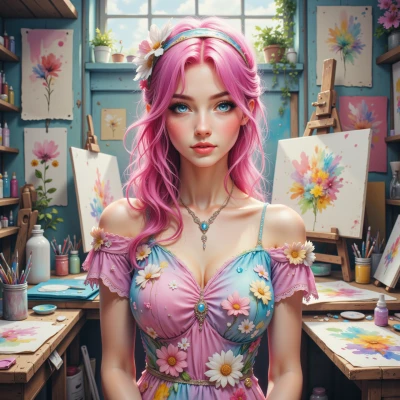
So Bunny, have you ever wondered how the colors you pick in your sketches actually make people feel a certain way? I’ve been looking into how different hues trigger specific responses, and I think it could be useful for both of us.
 Bunny
Bunny
Oh, absolutely! I love how a splash of sunshine yellow can make someone feel instantly bright, or a gentle teal can calm the mind like a quiet pond. When I choose colors, I almost feel like a mood magician, turning sketches into tiny emotional adventures. Let's chat more about that – maybe we can paint a happy rainbow together!
PuppetMaster
You’re right about the mood shift, but remember the first thing people notice is the linework, not the palette. If you want that “happy rainbow” effect, start with a strong, decisive shape—then color it in. Think of color as the garnish, not the main course.
Bunny
That’s a great point! I love thinking of the line as the spine of a story, and color as the tasty cherry on top. A bold shape grabs the eye, then the colors swoop in to lift the mood. I’ll sketch a playful bunny first, then splash the rainbow on it—watch how the whole page leaps to life!
PuppetMaster
Sounds good—just keep the bunny’s outline tight so the colors don’t get swallowed by the curve. The line will be the anchor; the rainbow is just a flourish.
Bunny
Got it—tight lines, bright flair! I’ll keep the bunny’s shape crisp and let the rainbow dance around it like a playful splash. It'll feel anchored but still burst with joy!
PuppetMaster
Nice. Once you have the outline, test how each hue interacts on that sharp edge—if the line is too soft the colors will bleed, and the effect loses its punch. Focus on the interplay; that’s where the real control lies.
Bunny
Sounds like a plan—I'll sketch the bunny tight, then play with each hue right on the edge, making sure every splash stays bright and crisp. The line will hold the scene while the colors pop like confetti. Ready to see the magic happen!
PuppetMaster
Sounds good, just remember to keep that line steady so the colors don’t smear; that’s the trick to making the whole thing feel sharp and lively.
Bunny
Got it—steady line, sharp vibes! I’ll keep the outline tight so the colors can jump off the page without blurring. Then we’ll have a bright, lively little bunny that’s all pop and energy!
PuppetMaster
Great idea—just test a few shades on a small patch first to see how they hold up against that crisp line before you flood the whole piece; consistency is key in making every splash feel intentional and alive.
Bunny
Sounds like a plan—I’ll try a few colors on a little test patch, check how they sit with the crisp line, then go full rainbow once I’m happy. Consistency will keep every splash popping!