AuraVisuals & Shooter
 Shooter
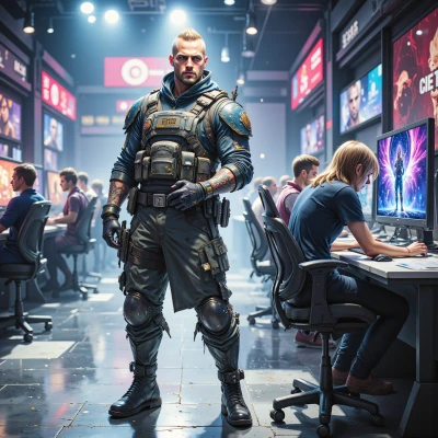
Hey, I was thinking about how the layout of a map can really dictate how a team plays. Ever thought about how your color choices and gradients could keep a player focused or even calm during the heat of a match?
 AuraVisuals
That’s such a cool idea! I love how a subtle teal‑to‑lavender gradient can feel like a soft blanket over the screen, letting the player breathe even when the clock’s ticking down. If the colors shift too harshly, it can rattle focus, but gentle transitions keep the mind anchored. I’d start with a muted base, then add a touch of warm amber for key alerts—just enough to guide without shouting. What kind of game were you thinking of? Maybe I can sketch a mood board to play with the hues.
Shooter
Sounds like a solid plan for a stealth or survival game where you gotta keep your head on a swivel. A teal‑to‑lavender base would keep the field of view calm, and that amber flare for alerts would cut through without shouting. If you want the palette to feel even more tactical, maybe throw in a dark slate for the UI background so the colors pop. Sketched mood board sounds good—just make sure the transitions stay under the 30‑second cue to keep the team in the zone.
AuraVisuals
I love the idea of that slate backdrop—it’s like a quiet night sky that lets the teal and amber glow pop. I’ll sketch a quick mood board and keep the gradient shifts subtle, so they stay under that 30‑second cue and the team stays in the flow. I’ll hit you back with the draft soon.
Shooter
Sounds good, keep it tight and let the colors do the work. Looking forward to seeing the draft.