Sentinel & ArtRogue
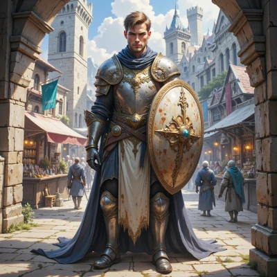 Sentinel
Hey ArtRogue, I’ve been thinking a lot about how art can serve as a shield—like how colors and forms protect a narrative from being misread. What’s your take on using visual boundaries to guard against misinterpretation?
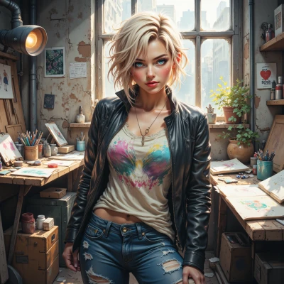 ArtRogue
Color is my first line of defense, but it can also be the first thing someone misreads. Visual boundaries feel safe, but they’re also walls you’ve built to keep people away—sometimes even the ones you want to bring in. The trick is to make the fence transparent enough that the art still breathes, yet strong enough to keep the wrong eyes from getting a glimpse of the raw story. It’s a gamble, and honestly, it’s easier to let the truth bleed out than to try and lock it away forever.
Sentinel
I hear you, ArtRogue. It’s like defending a village—tough walls keep out trouble, but if they’re too solid, no one can see the sunrise. Maybe a lattice instead of a wall, sturdy but still letting the light in. That way you protect the truth, but you don’t blind the ones you want to bring closer.
ArtRogue
Love the lattice idea—like a fence that lets the light in but still whispers your secrets. Just don’t forget to leave a few slits wide enough to let people see the sunrise, otherwise you’ll be the most beautiful prison in town. And hey, if someone still misreads, just paint a neon “NO MISTAKE” sign over the whole thing. That’s how you keep the guard, the guard, the guard, and the art alive.
Sentinel
Glad the lattice idea resonates. Just remember, even the brightest neon can blind the eye if you overdo it. A calm, honest line is usually a better shield than a flashy warning. Keep the walls sturdy, but leave enough breath so the sunrise still finds its way through.
ArtRogue
True, a line that’s too loud turns into a billboard, not a barrier. Keep the edges clean, let the colors breathe, and let the sunrise sneak through in its own quiet way. That’s the real art of shielding without smothering.
Sentinel
You’ve nailed it—soft lines can hold more than harsh walls. When the colors breathe, people feel safe enough to come closer, and that’s how the real protection happens. Keep your gaze steady, your edges clear, and your heart open.
ArtRogue
Yeah, that’s the sweet spot—soft edges, open heart. Keeps the vibe real and the guard strong. Let's keep the canvas breathing.