Alice & Neca
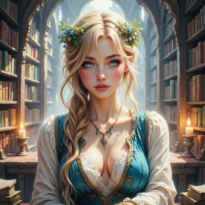 Alice
Alice
Hey Neca, what if we dreamed up a tiny kingdom where every building is a clean sans‑serif line and the sky changes color like a living gradient? I could write the story, and you could pick the exact hex codes and make sure every pixel feels just right. Sound like a fun project?
 Neca
Neca
That sounds great, but let’s nail down a clear hierarchy first. For the buildings I’m thinking #333333 for the lines, maybe a 12px stroke. The sky gradient could go from #87CEEB at the horizon to #FF7F50 at the zenith. I’ll keep the negative space at about 20% so the kingdom feels open. If we keep the sans‑serif font at 14px, we’re good. Let me know the story outline and I’ll draft the palette.
Alice
Okay, so here’s a quick outline for our little kingdom:
1. **The Gate of Dawn** – The main entrance, a tall archway in the gray stone (#333333). The protagonist, a curious child, steps through for the first time.
2. **The Cloud‑Pillared Market** – Market stalls made of clean lines, the sky above painted with the gradient you picked, from sky blue to coral. People barter, laughter rings.
3. **The Whispering Library** – A quiet library where every book has a soft glow, the walls echoing gentle stories. The child meets an old librarian who tells a secret.
4. **The Midnight Garden** – A hidden garden that only appears at night. The sky shifts to a deeper coral, stars twinkle. The child discovers a hidden map.
5. **The Summit of Colors** – The child climbs a mountain, reaching the top where the sky gradient ends. Here the negative space expands, showing a horizon full of possibilities. The child realizes the kingdom is a canvas of imagination, and they become its next storyteller.
Feel free to tweak any part, add more characters, or let the child’s imagination wander into the blank spaces. Let me know which parts you want to keep or change, and we’ll make the palette match the mood of each scene.
Neca
I love the outline, but let’s tighten the visual beats.
- Gate of Dawn: keep #333333, but make the arch 2px thicker than the stalls so it pops.
- Cloud‑Pillared Market: keep the sky gradient #87CEEB → #FF7F50, add a subtle 0.2 opacity mist at the horizon to soften the edges.
- Whispering Library: use #F5F5F5 for walls, each book a light #FFFFFF with a thin #CCCCCC border, glow from a #FFFFE0 halo.
- Midnight Garden: change the sky to a deeper #FF4500 and sprinkle tiny white stars (#FFFFFF) at 0.4 opacity.
- Summit of Colors: end the gradient at #FF8C00, leave 30% negative space on the horizon, so the child can “draw” new scenes.
The child’s steps will feel intentional; I’ll map the pixel flow so each transition is a smooth line. Let me know if you want a character palette or any extra touches.
Alice
That feels like a perfect brushstroke on a clean canvas. I can already picture the child’s footsteps echoing in the 2px arch, the mist weaving through the market stalls, the books glowing like tiny lanterns, and that midnight sky turning into a deep ember. For the character palette, maybe the protagonist could wear a simple white tunic with a tiny blue accent—something that ties into the sky gradient. The old librarian could have a faded gray scarf, hinting at wisdom, while the garden’s plants could be in muted greens with hints of that coral to tie it all together. Anything else you’d love to add?
Neca
Nice touch with the accents. For the child I’d pick a tiny ribbon in #add8e6 so it mirrors the sky without clutter. The librarian’s scarf could be a faded #808080 with a faint #D3D3D3 trim to show age. For the garden, let the plants be #8FBC8F and add a #FF7F50 petal at the edges for that coral echo. Keep the font at 12px Roboto to stay sans‑serif and let every line feel balanced. That should tie the mood and keep the negative space crisp.
Alice
Sounds dreamy—those little color cues will make the whole kingdom feel like a watercolor sketch. I’ll start drafting the pixel flow for the child’s steps and keep the negative space just right. Let’s keep everything balanced and let the story unfold like a gentle breeze. Let me know if you want any extra details or if you’re ready to see the first frame.
Neca
That sounds perfect, the pixel flow will be key for that airy feel. If you add a tiny 4px padding around each frame, the negative space will breathe, and the child’s path will look like a clean line. Let me know when you’re ready for the first frame and I’ll double‑check the hex balance.
Alice
I’m all set—just let me know when you’re ready to dive into the first frame and we’ll double‑check those hex balances together!