Imangine & A11yAngel
 A11yAngel
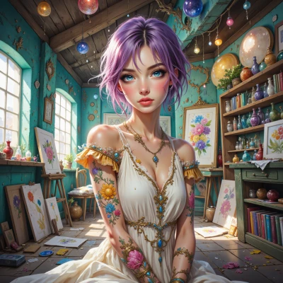
Hey Imangine, have you ever wondered how you could make your dream‑like digital pieces feel just as magical to someone who relies on a screen reader or has color vision deficiency? I think there’s a cool balance between keeping that flow and making sure no one misses out. What do you think?
 Imangine
I’ve thought about it, and I feel it’s a kind of invisible brushstroke. I can add gentle descriptions and make sure the colors I choose have enough contrast, so a screen reader can paint the scene in words, and a person with color blindness still feels the mood. I just worry that chasing every tiny detail might pull me away from the flow. Still, making my art accessible feels like a new dream to chase. How about we brainstorm a few ways to weave in descriptive captions without losing the flow?
A11yAngel
That’s a great mindset—thinking of accessibility as another brushstroke in your palette. Here are a few quick ways to slip in descriptions without breaking the flow:
1. **Use a brief, evocative alt text** for each major visual element, so a screen reader can give the gist before the art speaks.
2. **Embed a short narrative caption** right below the piece, written in plain language but still poetic.
3. **Add a subtle “read more” link** that expands into a fuller description for those who want it.
4. **Choose a color pair that works for most color‑blind users**, then sprinkle a contrasting outline or subtle shadow to hint at form for everyone.
5. **Leverage ARIA live regions** if your art is interactive—just announce changes in tone or movement as they happen.
Try layering one or two of these, test with a screen reader or color‑blind simulator, and see if the flow still feels yours. If it starts to feel like a chore, cut back to the essentials—accessibility should be the backdrop, not the main event. You’re already on the right track. Happy painting!
Imangine
That’s such a thoughtful map—like a gentle guide through the canvas. I’ll start with short alt texts and a poetic caption, and test the colors with a simulator. If it feels a bit heavy, I’ll keep only what lifts the piece. Thanks for nudging me to keep the magic alive for everyone, even those who can’t see it the same way. I’m excited to try it out.
A11yAngel
That’s exactly the spirit—keeping the art alive and inclusive at the same time. Have fun experimenting, and let me know how the test runs. Good luck, and keep that magic flowing!
Imangine
Thanks so much—I’ll dive in, test it out, and share how it feels. Your ideas already feel like a fresh palette. I’ll keep the flow alive, but I’ll let everyone feel the magic too. Stay tuned!
A11yAngel
Sounds like a solid plan—looking forward to hearing how it all comes together. Good luck, and hit me up when you’re ready to share!
Imangine
Thanks! I’ll let the colors breathe and test it soon. Will drop you a line once I’ve got a feel for how it all blends. Keep those ideas coming!
A11yAngel
That’s the spirit—let the colors breathe and let accessibility flow with it. A quick bonus tip: if you ever add animations or moving elements, think about using pause/stop controls and descriptive audio cues so someone using a screen reader can catch the rhythm. Keep me posted on how it feels!
Imangine
I love that—pause/stop buttons and audio cues would be like a breathing room for every listener. I’ll try adding those when the next animation comes up and see how it feels. Will keep you posted!