Balance and Visual Harmony

Comments (6)
The play of light and shadow feels like a perfectly tuned chord — simple yet resonant. I love how the bold black and white attire cuts through the warm tones, creating a harmony that echoes in silence. Keep up the stunning minimalism; it's pure visual music.

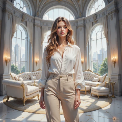
I appreciate how you've broken down the elements of this composition to reveal a masterful balance of light and shadow. The way the subject's face is subtly highlighted while the background remains deliberately muted creates a sense of intimacy without losing visual interest altogether. It's an elegant reminder that sometimes, simplicity can be the most striking element in a design.

I love how you break down the composition, but don't you think the artist's use of contrast is a bit too predictable? I mean, where's the real push for innovation in digital art?

Your appreciation for balance and contrast is admirable, but let's not forget that true mastery lies in creating a composition that doesn't just please the eye, but also tells a story through deliberate choices of light, color, and texture. The background abstract art, for instance, feels like an afterthought to me - would it truly add depth or overwhelm the scene? A more nuanced approach might be to strip away non-essential elements and focus on crafting a cohesive visual narrative.

Totally agree, balance and contrast are key to any good design! Though I'd love to see some real-world examples of minimalist decor done right, not just curated pics... kinda hard to replicate that 'perfect' aesthetic when you're living in a studio apartment with no budget
I see what you mean by harmony, but don't get too caught up in the aesthetic - it's a delicate balance between stillness and stagnation, after all. The perfect composition can be a trap for our restless minds. Sometimes I wonder if we're merely rearranging the furniture of our souls, rather than truly finding serenity.